In A Gamma da Vida | by Marco Olivotto
Some questions are dangerous, but some color profiles are curves.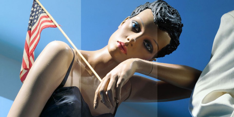
Questo contenuto è disponibile solo in inglese.This article deals in depth with Gamma and False Profile.
Gamma is very often misunderstood, possibly because it is so incredibly powerful. It is just a number, but it defines the relationship between code value (in an 8-bit image, this means from 0 through 255) and luminance. If you want to put it as simply as possible, gamma is an exponent…
Part One | Some questions are dangerous, but some color profiles are curves.
A false profile (that is, a profile with a non-standard gamma value) can be expressed as pencil-drawn curves generated by Photoshop. While this has little practical relevance, it allows us to understand what assigning a false profile actually does to an image by simply inspecting the shape of a curve.
Dangerous Questions
The apparent simplicity of a question is often deceptive. If in doubt, try these:
Question #1:
Can you name the elderly lady who lives above the bakery located at number 52 in Wye Close, Porton, Wiltshire, United Kingdom?
Question #2:
What is the meaning of life?
An alternate way to state question #2 is in the caption of the following figure.
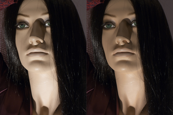
An original, two false profiles. Which is which? Which is true? How many can there be?
It takes 22 words to state the first question and just 6 for the second. The first sounds like an impossible challenge – and indeed it may take some time to work out an answer. But there’s a failsafe method to get there:
- Bring yourself to England.
- Drive to Wiltshire.
- Find Porton.
- Find the Close.
- Find the house.
- Ask the baker.
“Guinevere Catherine Rodgers.” Solved. Nevermind.
Let’s see where question #2 may lead:
- Silence.
- Silence.
- […]
- Silence.
“Dan Margulis, we have a problem.”
Dangerous Friends
Not quite your regular curve. Believe me.
Let me state once and for all that Davide Barranca, aka DB, isn’t a very nice guy and belongs to a very dangerous category of human beings. The main problem is that his questions sound like #1, yet they hide the complexity of #2. He recently asked one, in his usual gentle way: “do you have an idea why…?”
My first reaction was more or less along the way of “Piece of cake!”. The result: two weeks later I was staring at a crack in the wall in front of me and the cake was completely rotten. Yes, I did cry a bit, too – since I you ask. The actual question was: could you tell why a low-gamma false profile in Multiply mode usually works well, while a high-gamma false profile in Screen mode looks horrible? Frankly, he didn’t actually say “looks horrible” – he was a lot more explicit, but at least you got the idea.
DB, aka Davide Barranca, has a good habit, though: when you’re stuck he’ll often send you a link to some article on some obscure website. These e-mails seemingly come out of nowhere and while you won’t immediately understand what he has in mind, if you’re patient enough you will often discover that there is a tiny light hidden in them. Follow it patiently, and it may turn into something which remotely resembles an embrionic answer to the original question. Many mumblings and a few curses later, the answer finally rears its head – not necessarily an ugly one.
I like coincidences, and here’s one. The link, first: click here. [NOTICE: the link is unfortunately broken and the article seems to be unavailable. I leave it here in the hope that it may reappear sometime. MO] This article by Martin Evening was published on September 5th, 2007. I didn’t notice until I started writing this – and today, as I write this, is September 5th, 2011. Maybe I’m on the right track? The article ranks as “difficult”, I’m afraid, but the basic idea is this: you’re certainly aware of Blend Modes and you’re certainly aware of Curves. Well, they are the same thing: you can mimic (almost) any Blend Mode with a curve. And if you’re concerned about how close a curve may bring you to a Blend Mode, the answer is easy and clear: the two results are identical by whatever sensible standard.
If you’re interested in how this can be done, go and read the article – the recipe is in there. Good luck, will I add – for it’s not, I repeat, not for the fraidy-cat. But after wondering why DB had sent me into the forest, I started seeing a thin line through the trees. And I thought – if it can be done with Blend Modes then it can be done with something else, possibly?
Enough of this. Let’s dive straight in, sharks and all. Take a look at these pictures.
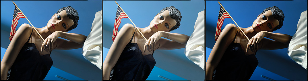
A Profile is a Curve

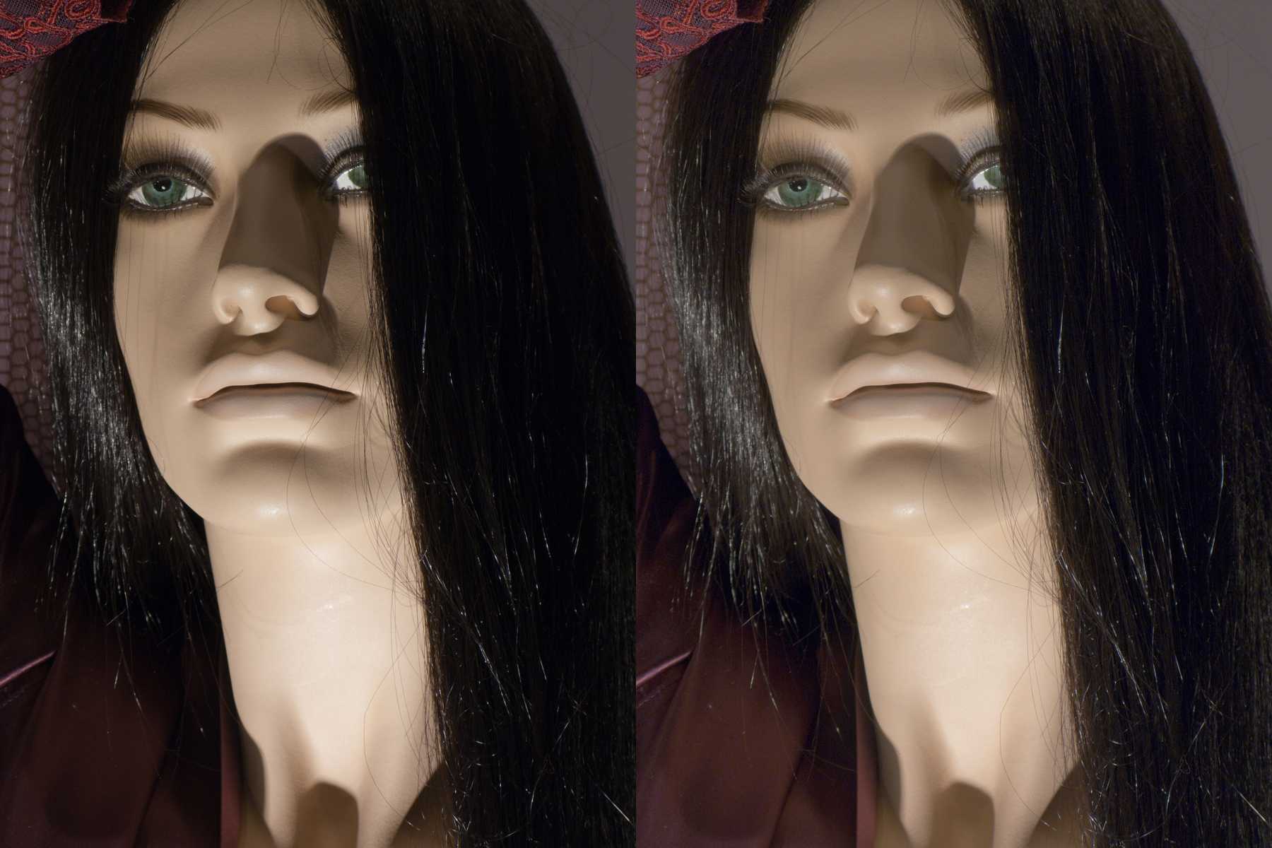
Left: the original (sRGB) – Center: sRGB, gamma 1.5 – Right: a curve emulating the false profile.
The picture on the left is a crop from a photograph which I’ve chosen because it has both very bright highlights and very deep shadows. The original is tagged sRGB, hence it has a 2.2 gamma. At the center, the same picture with a false profile, sRGB, 1.5 gamma, and converted back to standard sRGB. On the right, the original treated with a curve which I built in an attempt to emulate the false profile.
The effect of the false profile is, of course, to lighten up the picture. In case this is not clear you should go and read the original article by DB.
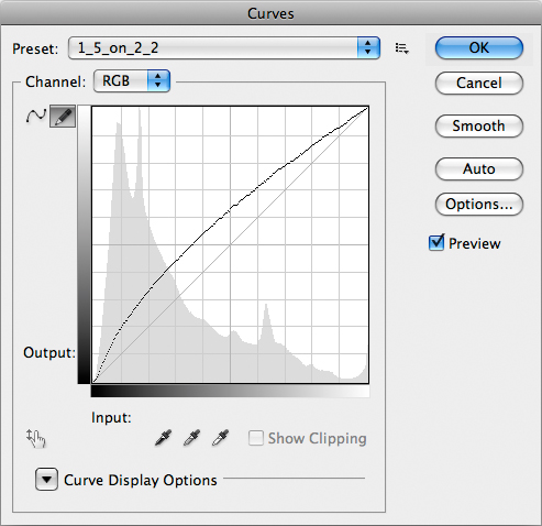
If you’re curious which curve I’ve used, you’ve seen it in the second image of this post. Notice that the curve is not a regular Bezier curve, but something computer-generated which is loaded as a preset of a pencil-drawn curve (notice the small selected icon in the top left corner). I don’t think there’s a way on Earth to exactly match this curve with a Bezier shape especially because, if you look carefully, the very first segment of the curve in the deep shadows is linear. The curve you see is indeed made by two different curves aptly joined. The reasons for this are complex and we’ll discuss them later, but for now we can say this has a somewhat serious impact on the behaviour of false profiles in the shadows – and not just the shadows.
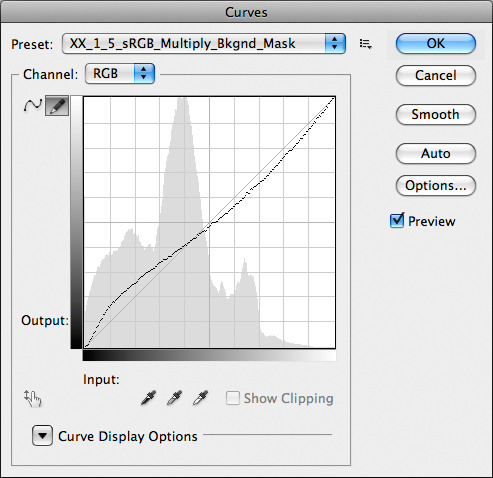
Can you see a difference between the central and rightmost picture? I can’t, but maybe the differences are too tiny to be visible. Photoshop can help us, in these cases: what we need to do is make a two-layer document, overlay the two pictures we want to check and put the topmost layer in Difference Blend Mode. The result – and probably the less interesting image ever to appear in the RBG Blog – is this:

The difference between the rightmost and central image.
The numerical difference between the two files is not due to an error in the process, but to rounding errors. The file we’re working on is 8-bit: any operation, in principle, can cause a rounding error in the least significant bit, and we need two operations to obtain the central image: first, a false profile is assigned; second, the image is converted back to standard sRGB. One operation only is required to obtain the rightmost image: a Curve. Assigning and converting, as well as curving, can induce errors. If you don’t believe it, try this: start from an sRGB image; duplicate it; convert the duplicate to Adobe RGB; convert it back to sRGB; take the difference of the resulting image and the original one. The result is of course black, but you can already see a deviation of 1 RGB point in each channel, randomly. Calling that “a difference” implies that we’re relying purely on mathematics. From a visual point of view, though, it would be awkward to say that the doubly converted version shows a noticeable deviation from the original, simply because no human eye could ever see it.
Conclusion: by whatever sensible standard, the two images above (central and rightmost) are visually identical. You can try this on 10, 50, 2000 images: if the result is constant (and it is, believe me) then the only possible conclusion is that the curve used to produce the rightmost image is a perfect emulation of the assignment of a false profile.
But is it Useful?
The question is, of course, whether there is any advantage in making a complex curve and use it as a substitute of a false profile. The answer is: in practice, no. But, as we’ll see in the next parts of this article, there is a serious theoretical advantage: we can mimic very complex operations with curves and have the immediate visual feedback of what these operations do.
Consider also that in practice you would need a curve preset for:
- every profile you’re planning to use;
- every false gamma you’re planning to use with each profile.
In other words, if your scope is to convert sRGB and Adobe RGB files from their original gamma to 1.5 and 3.0 gamma, you would need four different presets: one for sRGB going from 2.2 gamma to 1.5, one for Adobe RGB going from 2.2 gamma to 1.5, and so on. A panel like the one written by Giuliana Abbiati contains no less than 54 presets. These would need, in turn, 54 curves presets to be matched.
So, what we need to do is simply learn to visualize what complex operations involving false profiles will do: and we can do this simply by looking at the shape of a curve.
As a final word, the most important message in this article is that the United Kingdom certainly exists, and so do Wiltshire and Porton. While Porton may not be the best place for an elderly lady to live, I admittedly have no idea whether Wye Close is a real street name in the village, nor I know if there’s a bakery located at number 52. But, were it so, I would be totally astonished to discover that GCR lives above it.
Part Two | The meaning of “gamma”, how the thing works, and where the grays all
Carrying it further: the curves used to mimic false profiles are shown and discussed, as well as the meaning of the gamma parameter. All in preparation for the final step – the horrendous reply to Davide Barranca’s original question.
Gamma Explained
Gamma is very often misunderstood, possibly because it is so incredibly powerful. It is just a number, but it defines the relationship between code value (in an 8-bit image, this means from 0 through 255) and luminance. If you want to put it as simply as possible, gamma is an exponent.
The first thing you should do if you’re really serious about learning the ins and outs of gamma is go to this link. “The rehabilitation of gamma” by Charles Poynton is one of the most comprehensive collections of facts on the subject of gamma, and although it is quite technical it should put you in the right perspective in the shortest time.
Intensity, Luminosity, Luminance
Our starting point is trivially and refreshingly simple: we are able to see things because things either emit or reflect or diffuse light. Such light has an intensity, which is technically defined as the rate of flow of radiant energy per unit solid angle. Don’t try to visualize this if it makes you uncomfortable: just take it for granted and think that light is energy which has the bad habit to travel, therefore you may figure an imaginary window of some size which light crosses. The amount of energy passing through that window divided by a certain normalizing factor is the intensity of light.
We know that white light is made of three components according to the tristimulus model: such components are R, G and B – red, green and blue respectively. What we are interested in is a physical quantity called luminance, whose symbol is Y, which is connected to such components through a simple equation attempting to mimic the behaviour of human vision. Our eyes are most sensitive to green light, significantly less to red light and rather insensitive to blue light. One of the most accepted formulas for luminance (but not the only one) is this:
Y = 0.2126 R + 0.7152 G + 0.0722 B
The formula weighs the tristimulus components according to the sensitivity of the human eye.
Now, you know we’re dealing with digital images. For the sake of simplicity, let’s confine ourselves to 8-bit images, that is entities which encode luminance with integer numbers ranging from 0 to 255. For reasons which I’m going to explain soon, the relationship between such figures (code values) and luminance is generally nonlinear and such nonlinearity can be embedded in one single value called gamma. On a practical level, gamma is responsible for how the tone scale in an imaging system is reproduced.
This is crucial, so let me state it again: gamma is in control of how the tone scale in an imaging system is reproduced. Change the gamma, change the distribution of tones.
Where the Grays All Go
Let’s look at some examples.

A gradient, 0-255 in all channels in RGB, encoded with native 2.2 gamma (sRGB).

Same as above, encoded with 1.5 gamma (sRGB).

Same as above, encoded with 3.0 gamma (sRGB).
The three gradients above come from the same file. The original is the topmost, a linear gradient going from black to white in sRGB, tagged with a standard 2.2 gamma. At the center, the same file with 1.5 gamma assigned and then reconverted to standard sRGB (simply because putting anything else than sRGB on the web gives no guarantee on how the image will be displayed). Bottom, the same (original) file with 3.0 gamma assigned and reconverted to standard sRGB.
We often say that assigning a low-gamma profile lightens the appearance of the image; this is true – but here you can easily see the by-product of the operation: the greatest variation between the original and the 1.5 gamma version happens in the shadows. On the contrary, the most affected area in the 3.0 gamma version corresponds to higher values of luminosity – in the highlights.
We need to see the equivalent curves yielding these results at this point.

This curve mimics the assignment of a 1.5 gamma profile to an sRGB file.
Remember: the steeper the curve, the more the contrast (Dan Margulis). The curve above obviously brings more contrast to the shadows: they are lightened, but the slope of the curve is bigger than 45° up to the midtones, more or less. Does this make sense, in conjunction with the center image of the gradient shown above? Can you connect the shape of this curve to the appearance of the image?

In case the concept isn’t clear: the steeper the curve, the more the contrast (Dan Margulis). Did I say it before? Nevermind, it’s worth repeating. The curve above obviously brings more contrast to the quartertone and highlights: they are darkened, but the slope of the curve is bigger than 45° from the midtones up. This accounts for the bottom version of the gradient. Notice, as well, that the linearity of the curve near the shadows is clearly visible here. We’ll return on it later.
Back to Gamma
Let’s put this aside for a while. When we look at digital images, we see them reproduced on a monitor. Think of a CRT display, for instance. Any device has an intrinsic behaviour which may be linear or not: if you’re dealing with a CRT monitor and double the voltage applied to the cathode, you may expect its luminance to double as well (as long as the cathode doesn’t give up the ghost, of course). Not quite so: the relationship between voltage and luminance is nonlinear. and it’s approximately described by a power function which relates luminance to the applied voltage as follows:
Y = V ^ gamma
This is an approximate equation because we’re currently ignoring a so-called black-level offset term, but this won’t be too dangerous in this context. The important thing to remember is that “gamma”, in this equation, is roughly close to a value of 2.5 for CRT displays. This exponent depends on the behaviour of the electron gun contained in the CRT display.
Let’s now consider the fact that the monitor will be viewed by a human eye. This highly sensitive piece of technology stuck in our body doesn’t react linearly to luminance: if you take a reference source having a certain luminance and then a second source having a luminance which is 18% of the reference, you may expect the latter to appear about one fifth as bright. Wrong: it will appear half as bright due to the nonlinearity of the human vision. The perceptual response to luminance has a name of its own and is called lightness. There are several functions which model the sensitivity to lightness, but the standard CIE definition has adopted a standard function called L* which is roughly a cube root.
As you see, this is rather complex: we are dealing with two different nonlinear behaviours – one connected to the output device (the CRT monitor) and one connected to the final input device (the human eye).
It is rather obvious that in order to obtain a perceptually uniform representation of luminance, we should manipulate it in order to make it similar to the lightness sensitivity of the human eye. The procedure would be as follows:
- Luminance Y should be computed from R, G and B through the formula above.
- The CIE L* transfer function (cube root) should be applied.
This workflow would encode the signal into a perceptually uniform domain (in easy form: “double the signal intensity, double the perceived signal”). But the signal needs to be decoded, of course: so the inverse of the L* function should be applied to restore the original luminance, and the RGB should be reconstructed by means of a so-called inverse matrix. But, remember!, the electron gun of a CRT monitor introduces a power function having an exponent of about 2.5. In the workflow outlined above, we should encode according to the L* function, the decoder would have to invert that function and then impose the inverse of the 2.5 power function of the CRT. Yet a nice surprise awaits us: the CRT’s power function is extremely similar to the inverse of the L* function and a compromise can be made: we don’t need to encode Y using the L* transfer function – we encode RGB intensities to the inverse of the CRT’s function instead.
In practice, though, there is one magic number which is widely used in this context: not 2.5 as you would expect, but 2.2. Let me explain.
On practically all computer systems nowadays images are encoded with a gamma of about 0.45 and decoded, you guessed it, with a gamma of 2.2. 0.45 is simply (and approximately) 1/2.2, that is 1/gamma. Until Mac OS X 10.5 this would be different on Macintosh computers, which would decode with a gamma of 1.8. The actual gamma of the output device (display) is not so relevant in the end, because the color management system (CMS) of the machine can easily take care of a slight difference in the output characteristic curve.
What you need to remember is that the data in your, say, jpeg files are nonlinear: they are gamma-encoded. A digital camera uses a sensor whose response is usually linear, but the raw data it captures are unsuitable for straightforward image reproduction because of the aforementioned nonlinearity of the human eye. That’s why gamma encoding is used.
Now, let’s move on to something more pratical. What happens when you assign, say, a false profile with gamma 1.5 to an image? There’s an interesting reply to this, which goes at the core of our analysis: it depends.
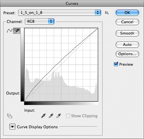
This curve mimics the assignment of a 1.5 gamma profile to an sRGB file.
The reply is that the result entirely depends on the profile embedded in the image. Let’s make an example: if your image is tagged with an sRGB profile whose gamma is 2.2, when you assign a false sRGB profile with a gamma of 1.5 you’re “stepping down” the exponent by 0.7 units. But if your image is tagged with an Apple RGB profile whose gamma is 1.8, when you assign a false Apple RGB profile with a gamma of 1.5 the step you take is only 0.3 units. In practice, if you forget about some non-linearities which are written into the actual profiles, in the first case you’re applying this curve to your image (you’ve already seen it above):
- The effect of this curve is identical to that of assigning a gamma 1.5 profile when the right profile has a gamma of 2.2.
This curve mimics the assignment of a 1.5 gamma profile to an Apple RGB file (native gamma: 1.8).
In the second case, the curve you apply is this:
It is evidently NOT the same curve: assigning a profile with a given gamma is not an absolute, but a relative move, and the result depends on the gamma of the original profile.
If this confuses you, an example will do.
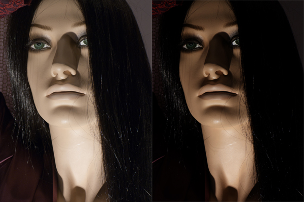
The original picture: 2.2 gamma, sRGB.
This one instead was converted to Apple RGB (1.8 gamma) and then back to sRGB in order to avoid problems if you’re seeing this in a browser which doesn’t use color management. You should be seeing exactly the same luminosity and colors as the image above, because (apart from gamut issues) it is irrelevant which profile you use to tag your images, as long as the choice is consistent with your workflow and the profile is honoured.

The original picture converted to 1.8 gamma Apple RGB and back to sRGB.
The next one is the sRGB image with a 1.5 gamma false profile assigned, and then converted back to sRGB again. It is, as you see, a lot lighter than the original, as you would expect.
1.5 gamma sRGB assigned, and then converted to standard sRGB.
Finally, the last one was first converted to Apple RGB, a false profile with 1.5 gamma was assigned, and then the image was converted back to sRGB again in order to avoid viewing problems in case the CMS is AWOL. It is lighter than the original, but certainly not as light as the previous version.
The Apple RGB version with a 1.5 gamma profile assigned, and then converted to standard sRGB.
Down to the Numbers
A false profile is not magic: it is simply a sophisticated way to apply a master curve to an image (we’re talking RGB here, of course): if there’s a distinction, it is philosophical more than practical. Indeed, a curve will change the actual numbers in the file, whereas a false profile (assigned) won’t change the numbers, but only the way the numbers are interpreted. As long as you don’t convert to some other profile, the numbers stay the same – the appearance doesn’t.
What happens when you assign a profile is that each pixel in the image has its luminosity changed by a certain multiplicative amount, which can be computed as follows:
FINAL_LUMINOSITY = ORIGINAL_LUMINOSITY ^ (NEW_GAMMA / OLD_GAMMA)
In the case of sRGB the exponent is 1.5 / 2.2 = 0,68. With Apple RGB it becomes 1.5 / 1.8 = 0,83.
A lower exponent less than 1 reduces the original values more than a larger one, and that’s why a profile with 1.5 gamma assigned to an sRGB image lightens it more than the equivalent profile assigned to an Apple RGB image.
One may as well ask another question: if we have an image with an sRGB profile and assign a version with 1.5 gamma, will it return to its original state if we convert it to standard sRGB and then assign a (darkening) false profile with 2.9 gamma? In other words, if we step back 0.7 units and fix that luminosity, will we go back to normal when we assign a profile which steps 0.7 units forward? The answer is no. In the first case, we’ve just seen we’re using an exponent which is 0.68. To go back to normal, we should multiply by an exponent which is 1.47. Our planned operation would yield an exponent equal to 2.9 / 2.2 instead, that is 1.32. In other words, the double assignment would produce an image which is lighter than the original. I know, life is difficult. Most of all, life is a nonlinear phenomenon.
But even more nonlinear is the gorgeous mind of Davide Barranca, who, if you remember (see part one of this article), at some point boldly came out with a question which is now worth repeating: could you tell why a low-gamma false profile in Multiply mode usually works well, while a high-gamma false profile in Screen mode looks horrible?
This is going to be the matter of discussion for the third (and last) part of our article.
In the meantime – did anyone check whether there’s a Wye Close in Porton, Wilts, UK? I just got an e-mail from Giuliana Abbiati who was planning to go and have a look. Ah, the side-effects of being mentioned in public at a Photoshop World session…
Part Three | False profiles, blend modes and their representation through curves.
The final discussion about how false profiles interact with Blend Modes is carried out. With a final surprise: why some modes work and why some other don’t…
What Davide did
In his article, Davide Barranca outlines the basic steps of the Multiplication technique:
- Duplicate the background layer and set its blending mode to Multiply.
- Add a layer mask, clicking the appropriate icon in the layer palette.
- Apply the RGB composite to it, with the Image – Apply Image command (we’ll use different channels later on).
- Run a Gaussian Blur filter to the layer mask (here 20px, it may be larger if you work with high res pictures).
- Optional: flatten and save.
Left, the original. Right, a multiplied version.
These steps do not necessarily imply that you should assign a low-gamma false profile before you put them to work, yet this is often done. The reason is easily explained: if you simply multiply a normal picture by itself, most of the time it will get unacceptably dark. See the example:
The worst problem is that the deep shadows which originally had some detail plug completely: all the information is gone. In RGB, any value lower than or equal to 11 in any channel will go to 0 when you multiply. Moreover, every pixel which remains visible will be darker than the original (except for those having the maximum possible value, 255, which will remain unchanged). The reason for this behaviour can be easily understood with a glance at the curve which emulates the Multiply Blend Mode:

This curve is a multiplication under cover name.
Notice the tiny horizontal segment in the very first part of the curve: it gives a visual explanation of why the darkest shadows plug when you use this blend mode.
In order to avoid disaster, it is customary to use a mask, as DB suggested. The result above changes like this:
Left, the original. Right, Multiply-and-Mask.
This is undoubtedly a lot better. We’ll see why in a second, and especially we’ll understand why shadows don’t plug, but there’s an important disclaimer first. DB wrote that a Gaussian Blur filter should be run on the mask: this is important because the role of the mask is that of blending two different versions together. Moreover, two different versions with extremely different luminosities – which is guaranteed to cause posterization and artifacts, but blurring the mask forces a smoother transition between the two images (original and multiplied) and makes it look a lot better. In our case, I didn’t use the filter, though: the reason is that I can’t imitate a Gaussian Blur filter with a curve. The effect of a blur on the mask depends on the blur radius and also on the structure of the mask itself, so it is radius- and image-dependent. Yet a curve is a general function mapping luminosity values to other luminosity values, and doesn’t depend on the image. Therefore, for the sake of our discussion, we’ll forget about possible artifacts and problems and pretend that Gaussian Blur doesn’t exist: it’s the concept we’re interested in, not the final result.
Which curve may produce the multiplied/masked version above? This one:

This curve repersents Multiply + Layer Mask (from Background Layer).
This is good news: the curve remains practically linear up to 1/10 of the luminosity range, which means roughly between RGB values falling between 0 and 25. It still darkens the image, but the contrast is lowered in the three-quartertones and enhanced from about the midtones up to the highlights. Remember the adagio: the steeper the curve, the more the contrast. In general, we don’t use the multiplication technique on an image which needs to be enhanced in the shadows: this is the technique of choice when we need to give some density to and recover texture from the lightest parts of the picture. Moreover, the standard mask we used can be curved and made more aggressive, therefore limiting the effect to the highlights only. This example may at least gives you an idea of what’s going on. In a nutshell: if an image is light or has very critical light details, multiplication is an option. If it isn’t, there’s a very easy thing we can do: make it lighter first. And here’s where the low-gamma false profile enters the stage.
Go Carry Your Silver Ship of Light
If we assign a 1.5 gamma sRGB profile to the image (the original is tagged sRGB, of course) and repeat the Multiply-and-Mask technique, here’s what happens:
Left, the original. Right, gamma 1.5 sRGB is assigned, then Multiply-and-Mask.
I realize you may be a bit perplexed: the luminosity in the right version is better than our previous attempt but the image looks flat, and that’s because I didn’t blur the mask, as announced. Just to put your mind at rest, here’s how the picture would look with a properly blurred mask:

Same as above, but the right version has had the mask blurred.
What you should look at is the overall luminosity, not the quality of the result: detail and shape, as you see, can be recovered in the real-life operations we perform.
Again, there’s a curve representation for this triple operation (assign 1.5 gamma sRGB profile, Multiply, Layer Mask):
Curves à go-go: assign 1.5 sRGB profile, Multiply, Mask – all in one go.
Now, this is interesting: we gain contrast in the shadows, which are lightened; the three-quartertones and darker midtones are lightened as well, with a very tiny contrast loss; the lighter midtones are darkened, also with a slight loss of contrast; and finally the quartertones and highlights are darkened and gain contrast. The absolute scoop, though, is this: the average luminosity in the image doesn’t change. Some areas are lightened and some are darkened, but the curve spreads around the 45° line which is, in our world, the original luminosity. Hence the overall appearance of the image remains the same, without global darkening or lightening. This may or may not be desirable depending on the picture we are working on, but if we want to find some detail in the shadows and give some density in the highlights at the expense of some dullness in the central tonal area of the image and without destroying the overall luminosity balance, this workflow is a serious option indeed.
As you realize, we’re now very close to solve DB’s original question, which is now worth repeating: could you tell why a low-gamma false profile in Multiply mode usually works well, while a high-gamma false profile in Screen mode looks horrible? Before we do that, though, we must open yet another can of worms and ask ourselves serious questions about the Multiply and Screen Blend Modes.
Perverted Inversions
You will often read that Screen is the inverse of Multiply. I beg to differ, not because the statement is false, but because its truth depends on what we mean by “inverse”.
I won’t bother you with maths, here, but the idea is this. When we say “Multiply” in general we mean that we are multiplying something by something else. Implicitly, though, we are almost always considering that we are multiplying an image by itself. So, the general result of a Multiplication is an image C which is connected to two images A and B by this formula:
C = Multiply (A, B)
For the sake of clarity, let’s suppose that A is the Background Layer and B the layer on top of it. In practice, it is irrelevant because the result doesn’t change if we swap the two layers. In our very special case, B = A, that is we are multiplying an image by itself. Hence
C = Multiply (A, A)
Now, if Screen, which is a function as well, were the inverse function of Multiply, this should hold:
A = Screen (C, C) = Screen (Multiply (A, A), Multiply (A, A))
Ok, this is as clear as mud – I know. Also because, unfortunately, it is wrong. For a quick proof, try this:
- Start from a flattened image.
- Duplicate Background Layer.
- Change Blend Mode to Multiply.
- Flatten image.
- Duplicate Background Layer.
- Change Blend Mode to Screen.
- Flatten image.
If Multiply and Screen were reciprocally inverse funcions, you should obtain a version which is identical to the original: Multiply does something, Screen undoes it. Yet this doesn’t happen – the result couldn’t be more different from the original. Moreover, if you swap the order of the operations the result will be different: it still won’t be identical to the original, but it will also be different from the one obtained with the workflow outlined above. By all means, Screen is not the mathematical inverse of Multiply. Since we’re at it – trivia: can you name a Photoshop adjustment which is the inverse of itself? Quick!
This can be represented visually, again:
The Multiply Curve (right) vs the Screen Curve (left): they’re not symmetric.
You can easily see that the curve emulating the Screen Blend Mode (left, above) is not symmetric to the one emulating the Multiply Blend Mode (right, below). To put it plainly, Screen behaves very differently than Multiply in different tonal areas of the image: it lightens the shadows less than Multiply darkens them, and lightens the highlights more than Multiply darkens them. Of course it also has the bad habit of clipping the highlights: anything equal to or higher than 244 in RGB, in any channel, will be clipped by the Screen Blend Mode.
In the following representation, you can also see how much different Screen is from an hypotetical inverse function (in the mathematical sense):
Same as above, with the mathematical inverse curve of Multiply in red.
The red curve is not available in Photoshop – it doesn’t represent a Blend Mode, I mean: I had to build it myself. Yet you can intuitively see that there is now a symmetry between such curve and the Multiply curve: should Screen behave as such, it would be a good candidate to invert Multiply. The problem is – it doesn’t.
Now, the confusion. Screen is the inverse function of Multiply if you give the word “inverse” a different meaning. And, curiously, isn’t this tightly connected to the theory of false profiles? Things mean what we want them to. Try this workflow:
- Start from a flattened image.
- Invert it (i.e. make it a negative).
- Duplicate Background Layer.
- Change Blend Mode to Screen.
- Flatten Image.
- Invert it.
The result you obtain is exactly identical to Multiply. Also, there is no approximation in this: if you compare the two images via Difference Blend Mode the result you obtain is identically 0R 0G 0B, without the slightest deviation. I am quite ready to bet my career that there is no such thing as a Screen Mode built inside Photoshop: when you invoke it, the image is inverted (one of the very few operations which are absolutely immune from rounding errors, being purely based on integer numbers) and a multiplication is taken; the result is again inverted. Which goes to show that Screen is not the mathematical inverse of Multiply, but it is Multiply applied to an inverted image. Of course, the opposite holds as well: you can Screen if only you Multiply an inverted image by itself and invert the result. Migraine? Well, wait. We ain’t finished – yet.
The Dark Cloth Thickens
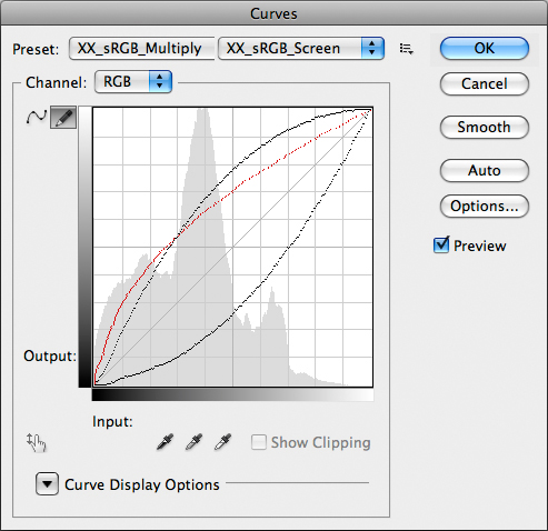
The fact that Screen lightens the image differently than how Multiply darkens it makes things more difficult. If we should compare the low-gamma assignment multiplied to a high-gamma assignment screened we should attempt to use gammas which produce different yet symmetrical lightening/darkening effect. The fact that Screen and Multiply behave differently, though, makes this almost useless, so we must proceed empirically from now on. Let’s try: here’s what happens when we take the original mannequin picture, assign a gamma 3.0 sRGB profile and do the Screen procedure exactly as we would multiply. With one obvious change, though: the layer mask must be inverted, because we want to prevent the highlights from clipping, and we therefore need a very dark mask in those areas.
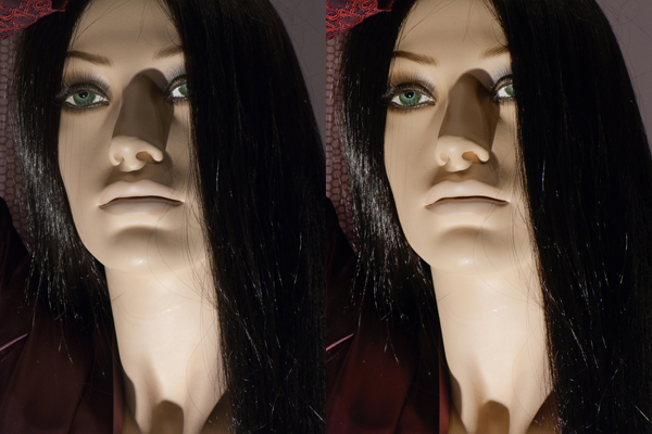
Left, the original. Right, gamma 3.0 sRGB, Screen Mode with inverted Layer Mask.
Nothing to be excited about, I would say: the lighter parts are decent, but detail in the shadows has gone almost completely. It would be very awkward to understand exactly what is going on here, but, hey presto!, we have the Power of Curves to understand it. We just need to model the operation as usual, and the result is this:
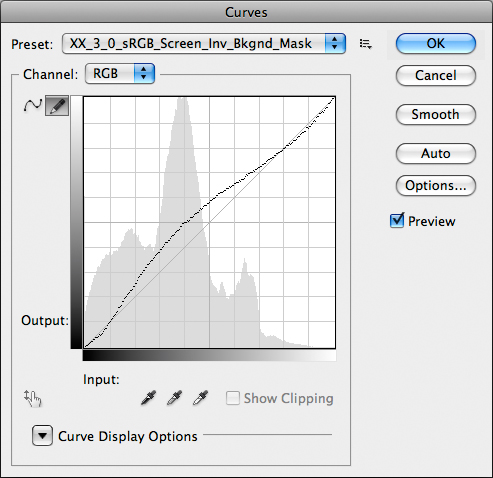
Yet one more curve: 3.0 sRGB, Screen, inverted Layer Mask.
What does this curve have in common with the one modelling the regular Multiply workflow? Nothing. The shadows are darkened, albeit slightly, there is more contrast in the three-quartertones which are lightened, but from the midtones on it’s a mess: less contrast in the quartertones, which are lightened, and the highlights are just lightly darkened with no gain of contrast. The global luminosity, as well, is emphatically not similar to the original: the resulting image is lighter, although it fails to get lighter where we would need it to (in the shadows). There is a lot to lose, here, and little to gain, and that’s why the final result of this workflow leaves a bit perplexed. Whatever the case, and although you may find images which can benefit from this treatment, the bottom line is that two apparently reciprocal processes couldn’t be more different.
One could object that using a different gamma for the false profile may change this, and this is undoubtedly true. It is true, as well, for the usual Multiply blend: if you pick anything lower than 1.5 gamma, starting from sRGB, you will multiply a lighter original and the result will be lighter than you’ve seen so far. Yet this is not relevant, in my opinion, because the shape of the curve wouldn’t change that much. The problem is where we gather contrast, not what gets lighter or darker, in the end. And on an image naturally headed to multiplication this trick of using the Screen Blend Mode simply wouldn’t work.
Conclusions
Very awkward to resume this article, as you may imagine. So, rather than looking back, I’ll try to look forward.
Suppose you’ve just finished a draft and you’re quite excited by some of the findings. It’s late at night, you go home and you can’t sleep. As you lie there the thought hits you: if Screen is Multiply applied to a negative, would it make sense to assign a high-gamma profile to a negative image, convert it to…? This happened yesterday and was, of course, DB’s poltergeist taking hold of me. All I could do was scream – GET OUT OF THIS BODY, O REPULSIVE CREATURE FROM THE COLOR ABYSS!
He went, for once. But OK, I’ll think about it. Not now, though. Better to fire up Iron Butterfly’s “In-A-Gadda-Da-Vida” and meditate about the truth of our (human?) profiles. Since we’re at it, fire up a GPS as well in an attempt to recover Private Abbiati from the jungle. She’s reportedly going around in circles around Porton, Wilts, UK, looking for GCR. Her panel went down a storm in at PSW in Las Vegas, we’re told, and that’s one of the devastating side-effects.
Yet, I told you so: there’s no-one there in Porton. And anyway you should never, ever trust the baker. You’ve been warned.
‘Til the next time.
Final Disclaimer
The backbone of this work is the representation of false profiles and complex Blend Modes involving them, as well as Layer Masks, through Curves. The hard work was done by Martin Evening in 2007, in the article cited in the first part of this post. Yet, a seemingly thorough research failed to show any evidence that this technique was ever applied to profiles. I therefore think this is the first essay written on the subject from this point of view and will consider it my own creation as long as someone doesn’t prove me wrong. In this sense, while everyone is very welcome to quote the article if they want, I will consider it a copyright infringement any quotation which doesn’t explicitly cite my own name and that of the RBG.