Follow Up | Get the Most Out of VitaminBW
VitaminBW in Depth - Before After Comparison - Hi-res - Tips and TricksDo your Black & White Conversions Look Flat?
This happens frequently because a color original get contrast from the luminosity values added to the color values.
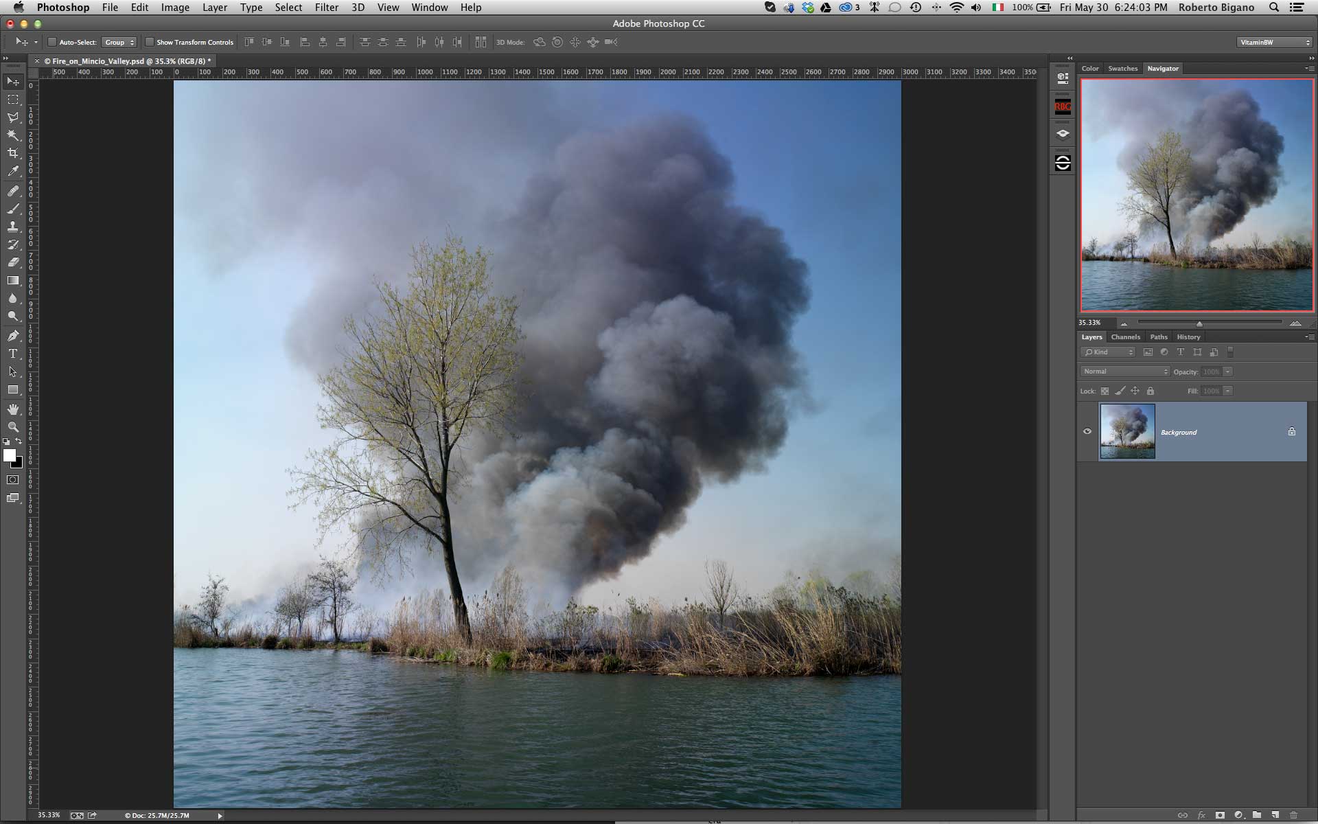
Take a look to this image. The color version is very pleasant, bright and contrasted, but if we delete the color informations it becomes flat.
Why? We have missed the part of the contrast given by color. This issue maybe fixed using a color filter that darkens a specific color and lightens his opponent. Many popular applications offer tools to convert to black white. In our opinion they are often very complicated to use and often yield poor results.
With that in mind, we decided to take a different “fresher”approach to better suit photographers’ needs.

A New Original Approach to Vitaminize your B&W conversions
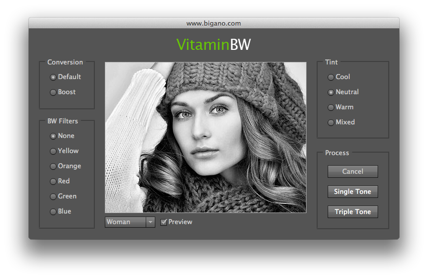
Below is the VitaminBW interface, very clean and simple – nothing like a Jumbo 747 control panel with hundreds of options confusing the user. It does not include options for artistic effects, vignetting, grain etc. It is just a simple tool to get easily the best possible black & white conversions . Simply press the “Single Shot” button. Or the “Triple Tone” button to be quickly introduced to advanced conversion techniques.
To start, we encourage our users to focus on the two main buttons: Single Tone and Triple Tone.
The customization option as Conversion, BW Filters and Tint can be left for later – we are sure you will appreciate the quality of these additional features.
Well, open VitaminBW from the Filter/VitaminBW Photoshop menu, press the “Single Tone” button with the default setting and compare the basic and “vitaminized” versions. Even if you like the result, delete the Vitamin group and press the “Triple Tone” button. Give it a second, it is worth the wait.
VitaminBW have no live preview, but you can preview all the possible combinations (Conversion, Tone, Filter) on two different test images, a portrait of a woman and an harbour landscape.
Single Tone. Easy as a Pie
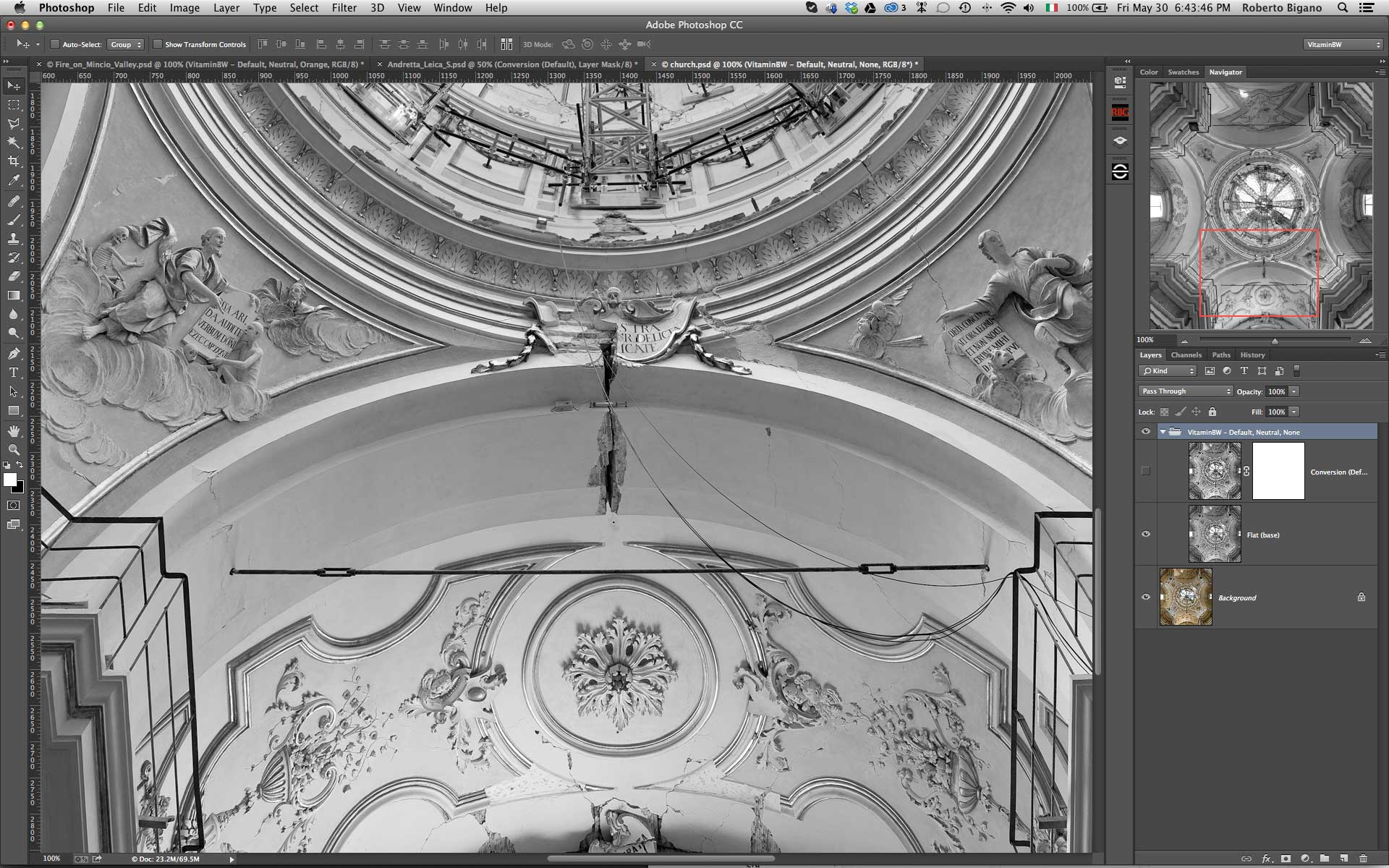
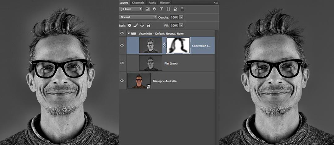
To get started, open VitaminBW and press the Single Tone button.
Vitamin will work now in the default mode: standard conversion, no filter, no color filters. You will get a folder containing a”flat” layer that is already a good black&white, better than the LAB (luminosity) channel and the VitaminBW layer with a blank (white) mask already applied.
Now you can:
- flatten the folder, if you like the image as is
- modify the opacity of the Vitamin layer in order to reduce the contrast effect
- paint with a black soft brush on the white mask to delete unwanted areas; in general the flat layer has the same tonal values.
Additional options:
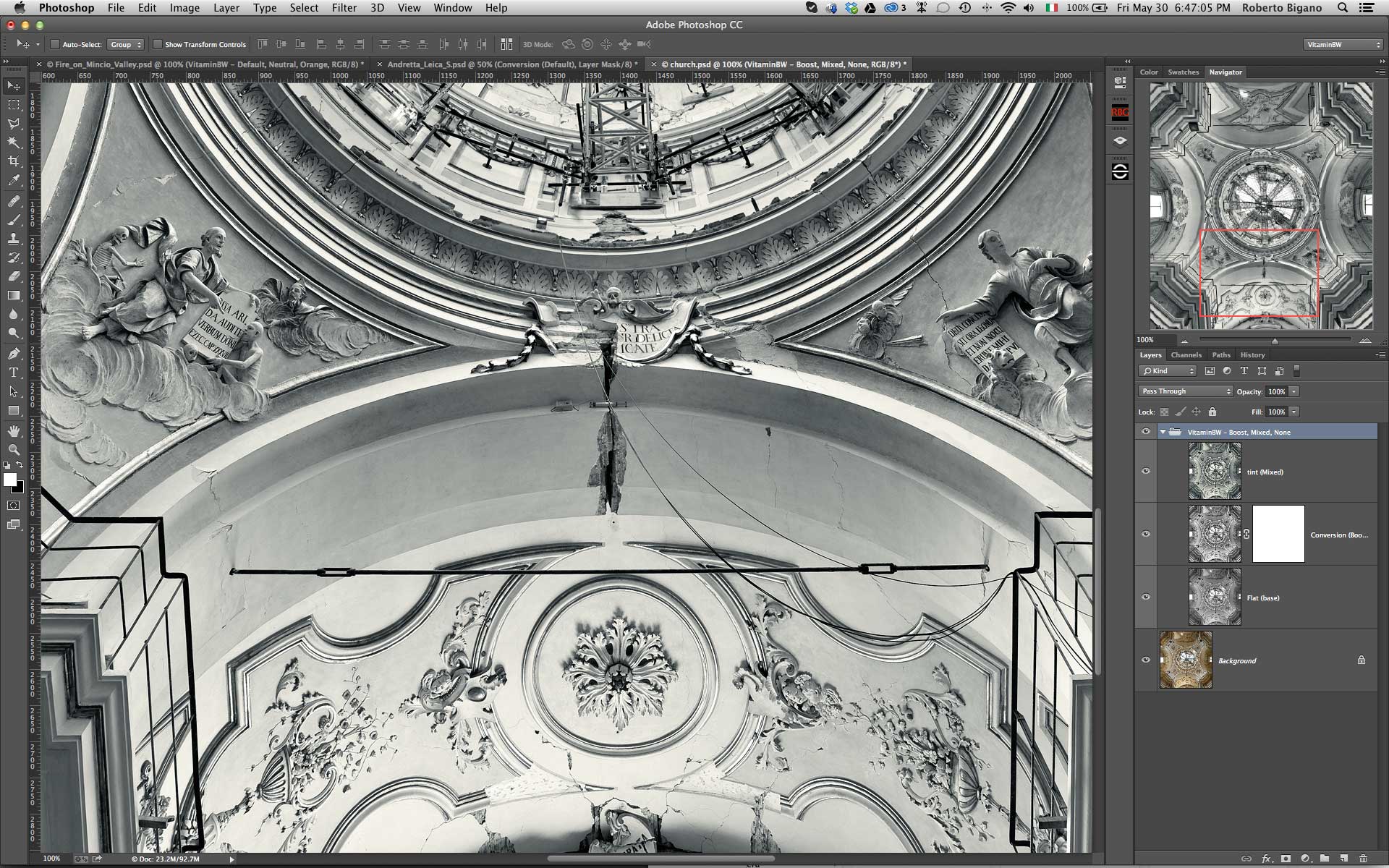
- increase the local contrast using Boost instead of Default conversion
- use color filters in order to get different tonal versions
- colorize the image with our cool, warm or mixed presets
Advanced B&W Tonal Editing Made Easy
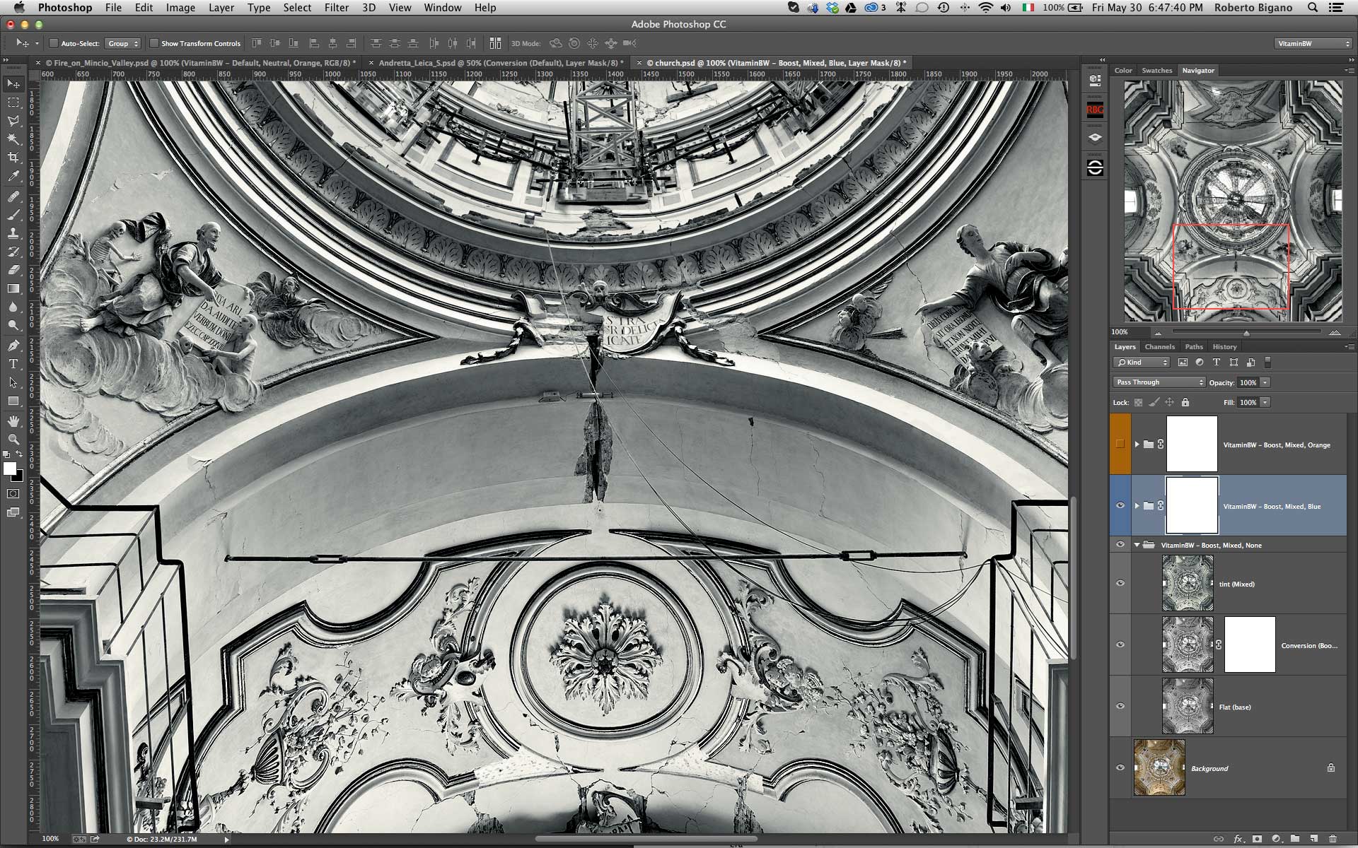
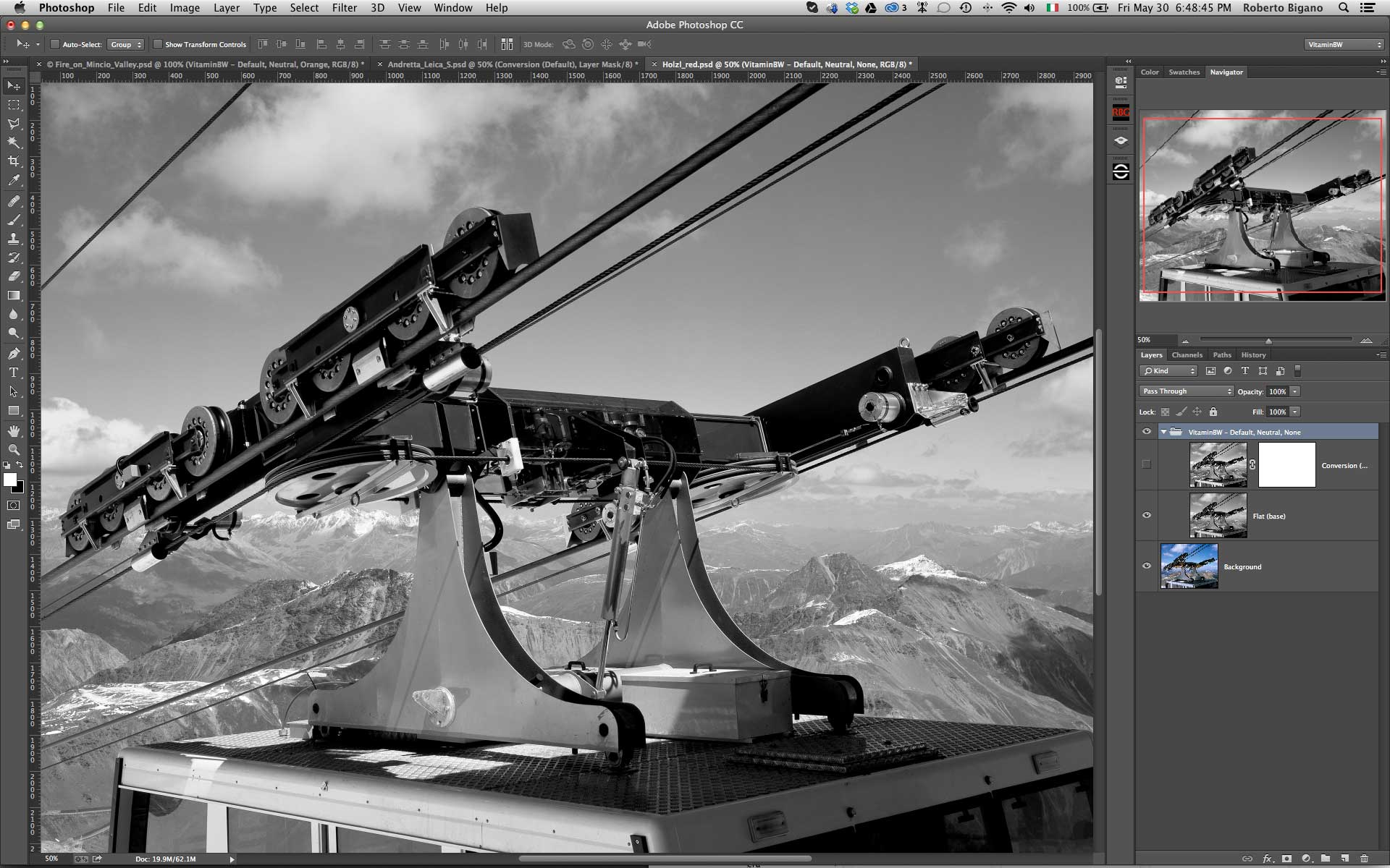
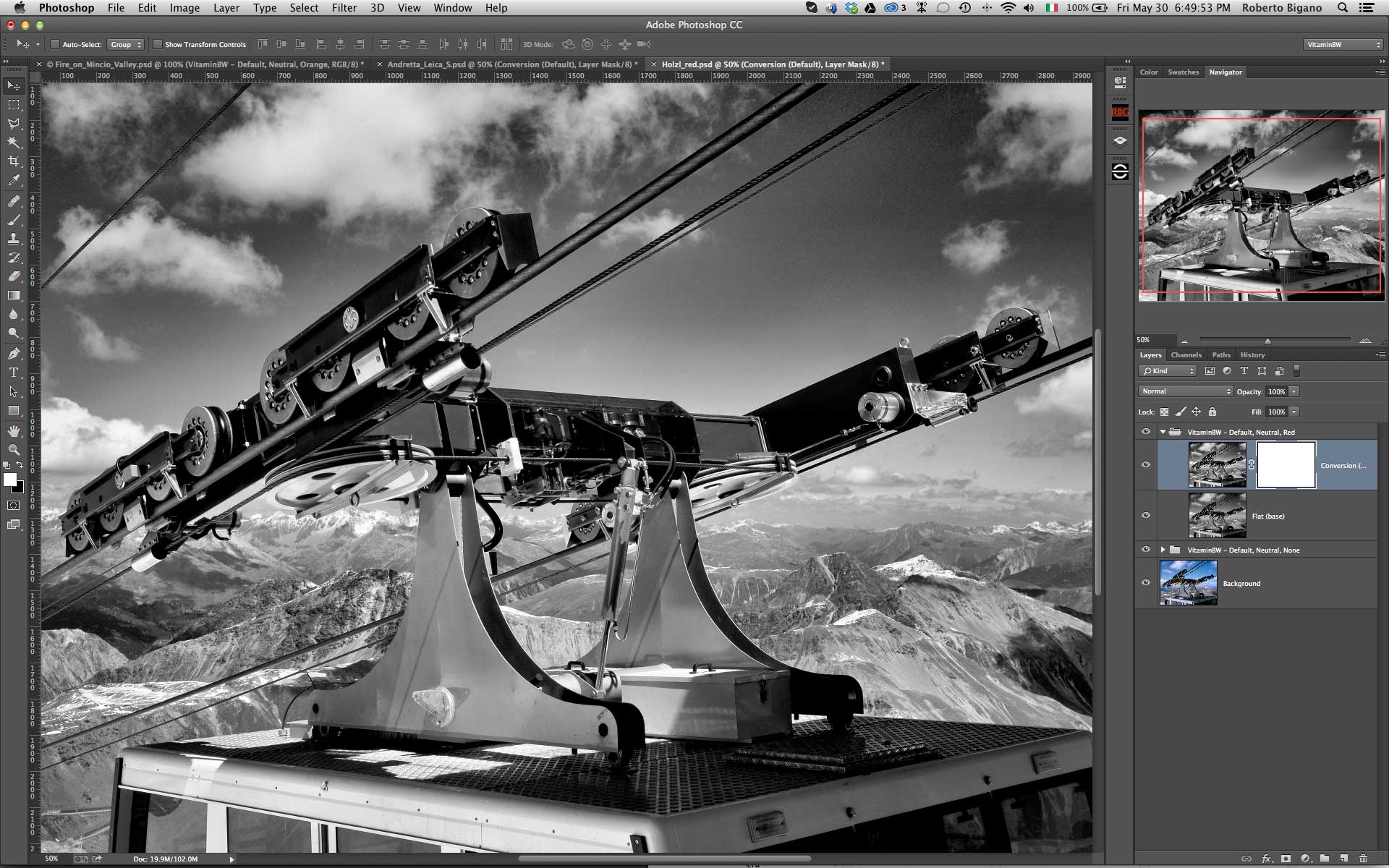
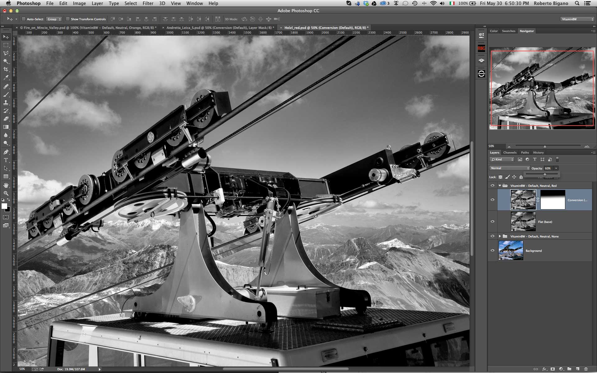
Triple Tone, with its exclusive approach, is probably VitaminBW ‘s biggest strength. With one click the userl get a choice three different tonal versions with anything necessary to quick compare an/or blend them. Triple Tone introduces non-expert users to advanced tonal editing techniques but also quickly becomes a “must have” tool for any photographer.
As said The Triple tone routine creates three groups with several layers, so it takes a while to perform . Now you can:
Toggle the Group visibility (the “eye” icon) to inspect and compare the result of orange and blue filtering with the default
Shift+Click on the Mask icons to enable them (red cross disappears).
Grab a soft white brush and start painting in the Mask to reveal the effect.
Of course you can try to apply different filters like i.e. the red , the “crazy horse” of the color filters able to get the best and the worst tonal values. In any case Triple Tone will dramatically improve the tonal quality of your black & white.
Look at the two examples below. We applied Triple Tone. The default conversion was quite good but the foliage, that in the color version was pleasant and contrasted), is not well defined because of a lack of contrast. The orange version was not very interesting but the blue one is great.
With a soft brush 200px wide we painted with white the black mask revealing the part of the blue layer that greatly improved the foliage and the image overall.

Color Filters to Change the Tonal Values in Black & White
In addition to the unfiltered version (none) you have five color filters option:
- Yellow: lightens yellows and warm colors in general and darkens blues and cold colors in general. Typically moderately darkens sky and increases contrast between blue sky and clouds. Slightly lightens skin tones.
- Orange: similar but stronger than yellow. Creates a medium/strong contrast between sky and clouds. Considerably lightens skin tones.
- Red: stronger than yellow and orange, it creates a dramatic contrast in the sky and landscape. Strongly lightens skin tones. The effect is similar to an infrared filter.
- Green: lightens foliage and darkens magenta/red areas. In some cases darkens skies. Can be used to improve pale skin tones.
- Blue: rarely used in traditional black & white photography, it is our favourite filter. It is very useful in creating contrast in the most (tonally) difficult areas, which is why we included it in the Triple Tone routine.

Color filters comparison
This is how the color filters work. This original was chromatically speaking a bit confused and not brilliant. The neutral version is not bad. The red is nice but surreal. The blue is very good, but the foliage of the palm is confused. The green is probably the best with a good separation of the red tones, a nice tonality of the palm ad an excellent rendition and contrast of the fence and the water. An even better result coud be obtained sandwiching the green and blue layers.
Red Filter, the Wild Card
Red – the wild card of tonal conversions, with results that range from outstanding to unacceptable.
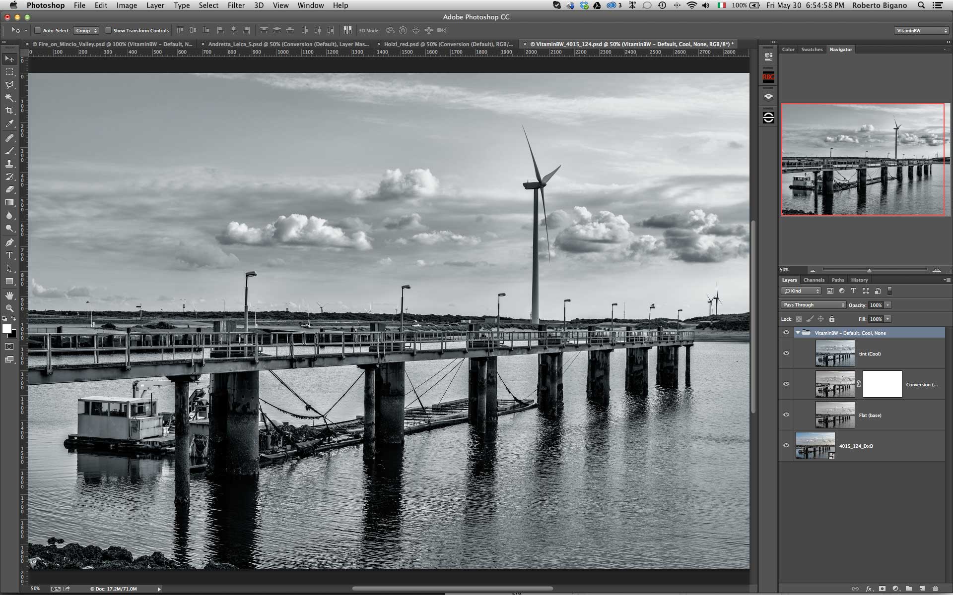
Warm, Cool and Mixed Color Tint
By default VitaminBW converts to a neutral gray: this means that the medium tone is 128,128,128 in RGB values.
You have thee different options to change the tint (hue) of the image: cool, warm or mixed. Our exclusive Tint preserves the highlights to obtain more pleasant color and tonal contrast. Mixed is a combined application of warm highlights, neutral medium tones and cold shadows, resulting in a pleasant and natural effect.
With the tint option selected VitaminBW creates a folder containing three layers: the basic and vitaminised neutral conversions, plus the tint layer at 50% opacity. By increasing or reducing the opacity you will be able to manipulate the saturated effect.
VitaminBW – Toning Comparison.
Neutral, cool, warm, mixed. All set by default at 50% opacity. Decreasing the opacity you will get a more subtle effect; increasing the opacity a more saturated effect.


Full Page Before/After Comparison
Click on the image to open the slide-show in full screen with captions